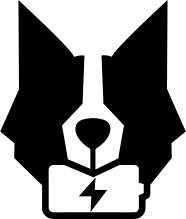
Horizontal — color (light bg)
Primary variant. Brand-primary leaf, ink text. Use everywhere on light backgrounds.
Logos, colors, typography. This page is a reference for the Chargekeeper team and a brand kit for partners embedding our visuals.
Question about brand usage? Contact us.
Use the variant that matches the background contrast. Always preserve a clear space around the logo equal to the height of the leaf.
Primary variant. Brand-primary leaf, ink text. Use everywhere on light backgrounds.

DNA variant. Signature green leaf, white text. Reserved for dark backgrounds and high-impact moments.
Signature variant — leaf in #38E54D (brand-DNA green). Reserved for dark backgrounds.

All white. For visually busy dark photography or monochrome supports.

Vertical DNA variant. Used in the site footer.
Signature variant — leaf in #38E54D (brand-DNA green). Reserved for dark backgrounds.

Vertical monochrome black. Print, fax, b&w supports.
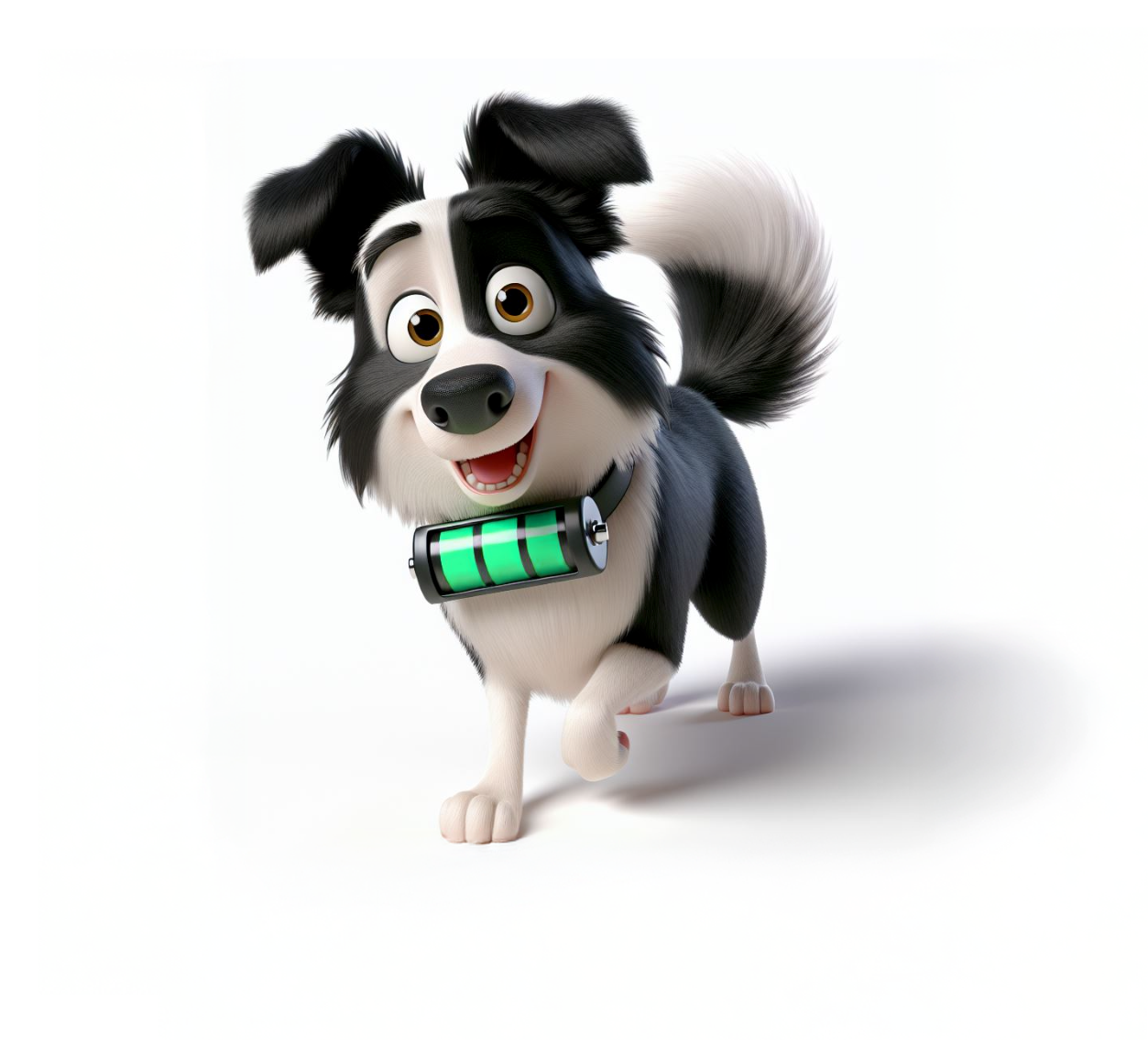
Brand character used for friendly illustrations, error pages and internal communication.
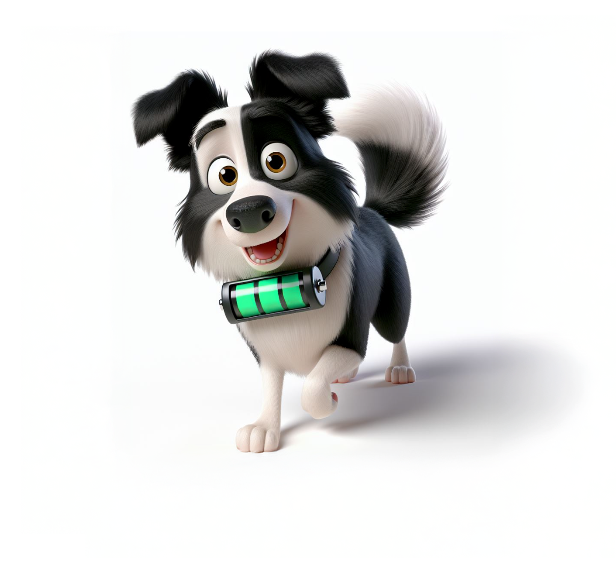
Keeper is our mascot. He mainly appears in playful contexts (404 page, internal materials, events). Use sparingly in commercial communications — prefer the logo in formal contexts.
Three distinct roles: a universal green for day-to-day use, a signature green for the brand DNA on dark, and an accent lime for typographic highlights. CSS tokens defined in global.css — always reference the token, never the raw hex.
--color-brand-primary Universal. Buttons, links, UI accents, "daylight" logo leaf. All backgrounds, all contexts.
--color-brand-primary-dark Hover / pressed state of brand primary.
--color-accent-lime Typography highlight on light backgrounds only ("yellow highlighter" effect on keywords). Not a brand color.
--color-signature Historical brand DNA. Reserved for dark backgrounds and high-impact moments: night logo, live badges, active sessions, dark hero accents. Never on light surfaces (readability).
--color-green-50 Very light backgrounds, hero gradients.
--color-green-100 Tinted secondary surfaces.
--color-green-300 Illustrations and intermediate states.
--color-green-500 Same as brand primary.
--color-green-600 Text on light backgrounds, subtle accents.
--color-green-700 Tertiary dark surfaces.
--color-green-800 Secondary dark surfaces.
--color-green-900 Deep dark surfaces, premium sections.
--color-green-950 Footer, signature dark backgrounds, dark hero.
--color-ink Primary text color. Same as green-950.
--color-paper Primary background, surfaces.
--color-paper-soft Alternating sections, cards.
--color-paper-mute Borders, dividers, disabled states.
Two main fonts — display for headings, sans-serif for body. Mono stack for code.
Display — headings
--font-display EV supervision built for pros
Geometric sans, premium character. Reserved for H1–H6.
Fallback: General Sans, Inter, system-ui.
Body & UI
--font-sans The complete, interoperable and scalable supervision solution.
Neutral sans-serif with excellent on-screen legibility. Used for all body and UI text.
Fallback: Inter, system-ui, Segoe UI, sans-serif.
Code, tokens
--font-mono OCPP 2.0.1 · API_KEY=ck_…
System stack: SFMono-Regular, Menlo, Monaco, Consolas, monospace.
No custom font — OS performance and consistency.
Download logos directly from this page. For additional formats (AI, EPS, high-resolution vector) or specific co-brandings, get in touch.